Pantone on kraft: getting brand colours right on corrugated
Why a Pantone reference never looks the same on brown board, which colours survive the substrate, and how to sign off a match that repeats on the next run.
By Tradepack ·
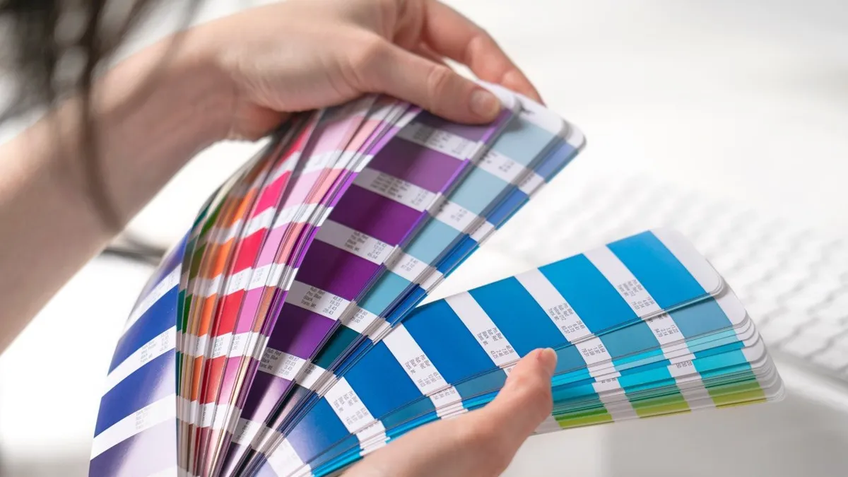
A brand team sends a Pantone reference. The box comes back and the colour is not the colour. Nobody has done anything wrong, and the conversation that follows is avoidable if the substrate is discussed before the artwork is approved rather than after.
What a Pantone reference actually is
A Pantone chip is an ink formulation printed on a specified paper under controlled conditions. The book comes in coated and uncoated versions because the same ink on those two papers produces two visibly different colours, and both are correct.
Corrugated liner is a third surface the book does not cover. It is uncoated, it is absorbent, and unless you have paid for a bleached white top it is brown. Flexographic ink is translucent: it tints the surface rather than covering it. Whatever is underneath contributes to what you see.
So the brown comes through. Every colour printed on kraft lands warmer, darker and less saturated than the chip, in a way that is entirely predictable and completely unavoidable.
Which colours survive and which do not
As a rough guide, from the ones that work to the ones that do not:
- Dark, saturated colours hold up best. Deep blues, burgundies, forest greens, black. There is enough pigment density that the substrate contributes less.
- Strong warm colours are the natural fit. Reds, oranges and warm browns are already moving in the direction the kraft pushes them.
- Cool mid-tones drift. Blues and greys pick up warmth from the board and can read green or muddy.
- Pale and pastel colours largely disappear. A light tint over brown is barely distinguishable from the board.
- White is not available in the normal sense. Our in-house flexo prints colour onto board, not an opaque white base under it.
If a brand’s palette lives in the pale and cool end, the honest conversation is about substrate rather than ink.
The white liner question
White-top or fully bleached liner gives a surface much closer to the paper a Pantone book is printed on, and colours land close to expectation.
It also costs more per square metre, and the price gap is not trivial at trade volumes. The decision is worth making explicitly rather than by default:
- Kraft for transit cases, trade and wholesale, back-of-house, and brands whose identity suits an unbleached look. Most corrugated.
- White liner where the pack is customer-facing, where the palette will not survive brown, or where a retailer specification calls for it. Common on shelf ready packaging and premium e-commerce.
A third option is often overlooked: redraw the artwork for the substrate. A design built for kraft, using the board as a colour rather than fighting it, usually beats the same design forced onto white liner at extra cost.
How a match is actually produced
The sequence that works:
- Specify the uncoated Pantone reference. The U book, not the C book.
- Mix to formulation. Our inks come from Antonine, who supply a dispensing system fed from high-strength base inks, so a colour is mixed to a recorded recipe rather than approximated by eye.
- Pull a drawdown on the actual board. Not a proof, not a screen, not a different grade. The liner and flute the job will run on.
- Approve it physically, in daylight. A screen cannot show you an ink film on brown fibre. If the brand owner is approving remotely, post them the drawdown.
- Keep it as the standard. The approved drawdown and the recorded formulation are what the next run is matched to, which is how a repeat programme stays consistent.
That approved sample, rather than the Pantone number, becomes the contract. It is worth saying so in writing, because “Pantone 288” and “this drawdown” are different commitments.
What the flute does to the print
Post-print flexo puts ink on an assembled, fluted board, and the board is not flat at a microscopic level.
- Washboarding. The liner dips slightly between flutes, so large solid areas can show faint stripes. It is more visible on heavier flutes and on dark solids.
- Dot gain. Ink spreads into an absorbent surface, so tints print heavier than specified and fine screens fill in.
- Flute choice. E flute gives the smoothest surface and the cleanest print; B and C are coarser. If print quality is the priority, the board grade is part of the print decision.
Practically: keep screens coarse, avoid gradients and fine reverse-out type, and prefer line work and solids. A design that is robust to a few per cent of dot gain will look right on every run rather than only on the good ones.
What we print, and what goes elsewhere
In house we print up to two colours of flexographic, water-based, with Pantone matching, applied inline on the same pass that cuts and creases the blank. That covers brand marks, type, pricing panels, barcodes and handling marks, which is what most trade packaging carries.
Photographic artwork, four-colour work and laminated finishes go to digital, up to four-colour flexo or litho-lamination through our print partners. Our guide to print methods covers which is worth the difference at a given run length.
What to tell the brand customer
Three sentences usually settle it. The chip is printed on white paper and the box is brown, so the colour will land warmer and darker. We will pull a drawdown on their actual board for approval before anything runs. That approved drawdown, not the chip, is what every repeat will match.
Said at enquiry stage, that is a normal part of specifying a box. Said after delivery, it sounds like an excuse.
Send us the artwork and the board you want it on and we will pull a drawdown before you commit.